Constructing a good chart to tell a story is a vastly underrated skill, even among those of us who work (or have worked) in the corporate world. But in the econ community, I’d argue this skill is even more underrated.
A wonderful resource to follow to try and get better at this skill is Jan Schultink’s blog. I’ve been following him for over a decade, and while his blog may not have helped me become a better creator of effective charts (I think I still have a long way to go), it has certainly made me a better consumer of charts. Let me be clear: the fact that I’m not good enough at creating great charts is my fault, not Jan’s! His blogposts are an invaluable resource if you want to become a student of creating better charts.
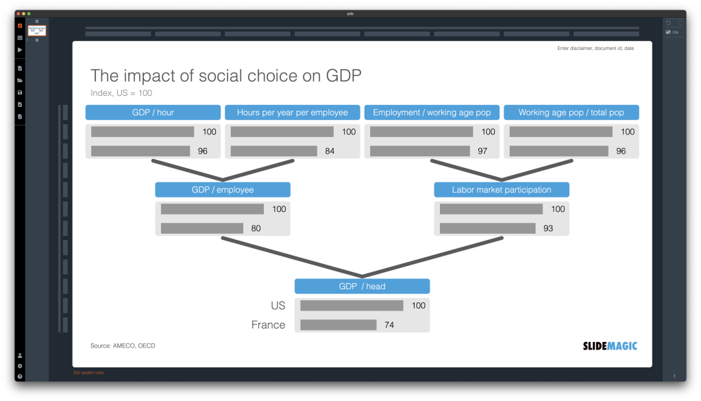
His latest post is a good example:
Jan asks if there is a better way to tell this story, and comes up with this answer:
I know economists who will say that this doesn’t pass the cost-benefit test, and spending that extra time to create this chart isn’t worth it. But I would disagree: effective dissemination of research, especially to the general public, is an equally important part of the process, and we need to do a better job of it. Especially so in our brave new world of far too much information and not enough time to process it.
A simpler, clearer color scheme, and simple bar charts help in telling this story better than the original chart in the embedded tweet. Spend the time it takes to build a better chart, because we need all the help we can get in communicating our community’s research better.
Two final points:
- If you are a student, Jan offers free access to his awesome software, and I would recommend that you try it.
- There is a way to make Jan’s chart shown above even better, and it is by making use of a concept from my favorite Jan Schultink post, ever. I’ve copied this idea, except I apply it to concepts I teach in class, not only to charts that I create.
What would your “So What?” title be for the chart that Jan has created? Go ahead and try and answer this question for yourself, and the chart will become clearer still.
